Originally posted by Gatekeeper828, post: 49623:
Blood doesn't fit with the background of the website or text. Font seems too messy in my opinion. Also, blue needs to have more gray in it and the yellow text needs more yellow should stand out a bit more. That's just my opinion though.
I think it'd be cool to see FaceWAN with much more warmer colors such as yellow, red, orange, and white but that would require a complete makeover of how things look.
Here it is with out the blood. I just added the blood as my own kinda flavor, as everything I do is bloody as fuck. But I knew it wouldn't go too well with the FaceWAN theme...

The blue gradient is actually the exact colors from the Gmod logo (Darkest to Lightest) and I see what you mean about the yellow, the yellow is also the same color from the Gmod logo. I figured it would look better matching rather than seeing the yellow Gmod logo and the off yellow "Servers" text, speaking of which, here's a copy with out the servers text, I couldn't decide if it looked better with our without it, so I left it...

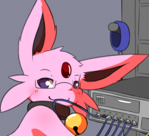
And hmmm.. A complete makeover do you say?
Well, one day (Probably early in the AM like when I did this) I'll throw together an example page for Espeon using some of the suggested colors

P.s.
Thanks for the feedback, always great to hear others opinions.. Especially when you just love everything to be bloody LOL.

I am 75% addicted to Counterstrike.
What about you? :wcc: